Accessibility & Input Methods
Not everyone interacts with a screen the same way. Pie Talker supports switch scanning, dwell selection, full keyboard navigation, large targets, high contrast, and screen readers. Multiple paths to the same voice.
Multiple Ways to Communicate
AAC users have vastly different physical abilities. Some can tap a touchscreen precisely. Others can only press a single button. Some can aim a pointer but not click. Others navigate entirely by keyboard. Pie Talker provides multiple input methods so the app adapts to the person—not the other way around.
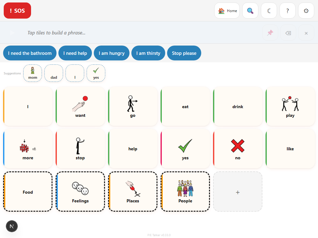
Direct Touch
The default. Tap any tile to speak it. Works with fingers, styluses, and touchscreen-compatible assistive devices.
Switch Scanning
Navigate the grid with one or two switches. The app highlights options; the user presses a switch to select.
Dwell Selection
Hover over a tile to select it. A visual progress ring fills up. When it completes, the tile activates. No click needed.
Keyboard Navigation
Arrow keys move through the grid. Enter or Space activates a tile. Tab moves between regions. Full keyboard access throughout the app.
All input methods can be combined. A user might primarily use touch but switch to scanning when fatigue sets in. Settings are saved per profile, so each communicator keeps their own configuration.
Switch Scanning
Switch scanning is an input method for people who cannot directly touch or point at tiles on screen. Instead, the app systematically highlights groups of tiles, and the user presses a switch (a physical button, adapted device, or keyboard key) to make selections.
Scanning patterns
Pie Talker supports three scanning patterns. The best choice depends on the communicator's motor abilities and cognitive load preferences:
- Row-column scanning — The app highlights one row at a time. Press the switch to select a row, then individual tiles within that row are highlighted one at a time. Press again to select the tile. This is the most common pattern and works well for grids with many columns.
- Column-row scanning — The inverse. Columns highlight first, then individual tiles within the selected column. Useful for tall, narrow grid layouts or when the user finds vertical scanning easier to track.
- Linear scanning — Every tile is highlighted one at a time, left to right, top to bottom. Simpler to understand but slower for large grids. Best for communicators with very few tiles or who are just learning to use scanning.
Configurable speed
The scan speed (how long each item stays highlighted before moving to the next) is adjustable from 500 milliseconds to 5,000 milliseconds. Faster speeds allow quicker communication but require faster reaction times. Slower speeds are more forgiving.
| Setting | Range | Description |
|---|---|---|
| Scan speed | 500ms – 5,000ms | Time each item stays highlighted before auto-advancing |
| Acceptance delay | 0ms – 2,000ms | Confirmation timer after switch press (prevents accidental selections) |
| Repeat delay | 0ms – 3,000ms | Cooldown before the same switch press is accepted again |
| Switch count | 1 or 2 | One switch (auto-scan + select) or two switches (advance + select) |
| Auditory cues | On / Off | Speaks the tile label as each item is highlighted |
One-switch vs. two-switch
In one-switch mode, the scan advances automatically at the configured speed. The user has a single switch that means "select this." In two-switch mode, one switch advances the highlight and the other selects. Two-switch mode gives the user full control over pacing but requires the ability to operate two switches.
Auditory cues
When auditory cues are enabled, the TTS engine speaks the label of each highlighted tile as scanning progresses. This is critical for users with visual impairments who are using scanning, and also helps users who process auditory information better than visual.
How to enable scanning
- Open Settings → Access → Switch Scanning.
- Toggle Enable Scanning to on.
- Choose a scanning pattern (Row-Column, Column-Row, or Linear).
- Set the scan speed to a comfortable pace—start slow (2,000ms) and speed up as the user gains confidence.
- Configure switch count, acceptance delay, and auditory cues as needed.
- Return to the grid. Scanning begins automatically.
Dwell Selection
Dwell selection allows users to activate tiles by hovering over them for a set duration, without clicking or tapping. This is essential for people who use eye-tracking devices, head-tracking cameras, or any pointing device where the user can aim a cursor but cannot perform a physical click action.
How it works
- The user moves the pointer (eye tracker, head tracker, mouse, trackball) over a tile.
- A visual progress ring begins to fill around the tile, showing dwell progress.
- If the pointer stays on the tile until the ring completes, the tile activates (speaks the word).
- If the pointer moves away before the ring completes, the timer resets—no accidental activation.
Configurable dwell time
The dwell time (how long the pointer must stay on a tile to activate it) is adjustable. Shorter dwell times mean faster communication but require more precise control. Longer dwell times are more forgiving but slower.
- Short (500ms–800ms) — For experienced users with good pointer control.
- Medium (1,000ms–1,500ms) — A good starting point for most users.
- Long (2,000ms–3,000ms) — For users who need extra time to stabilize their aim.
Visual feedback
The progress ring provides continuous visual feedback. The communicator always knows how close they are to activation, which reduces anxiety and accidental selections. The ring color matches the app's accent color and is visible in all display modes including dark mode and high contrast.
How to enable dwell selection
- Open Settings → Access → Dwell Selection.
- Toggle Enable Dwell to on.
- Set the dwell time. Start with 1,500ms and adjust based on the user's comfort.
- Return to the grid. Hovering over tiles now shows the progress ring.
Keyboard Navigation
Every interactive element in Pie Talker is accessible via keyboard. This is not an afterthought or a separate mode—keyboard navigation is built into every component from the ground up.
Grid navigation
- Arrow keys — Move focus between tiles in the grid. Up/Down move between rows, Left/Right move within a row.
- Enter or Space — Activate the focused tile (speak the word, open a folder, or add to the phrase strip).
- Tab — Move focus between major regions: phrase strip, quick phrases, prediction row, tile grid, and navigation buttons.
- Escape — Close open panels (tile editor, settings, lightbox).
Focus order
Focus order follows the visual layout: left to right, top to bottom. This matches what screen reader users expect and what sighted keyboard users see on screen. The focus order is:
- Phrase strip (current phrase, speak button, clear button)
- Quick phrases bar
- Prediction row (if visible)
- Tile grid (navigated with arrow keys)
- Navigation (breadcrumbs, back button, search)
Large Targets
Touch targets must be large enough for people with limited fine motor control. Pie Talker provides three tile size options:
- Default — Standard sizing that exceeds WCAG minimum requirements. Tiles are at least 48×48 density-independent pixels. This works well for most users on tablets and larger phones.
- Large — Increases tile dimensions for users who need bigger targets. Reduces the number of tiles visible on screen but makes each one easier to hit.
- Extra Large — Maximum tile size (64×64dp minimum). Designed for users with significant motor impairments. Fewer tiles visible per screen, but each tile is a generous target.
Find this setting in Settings → Access → Tile Size. The grid layout automatically adjusts the number of columns and rows to fit the chosen tile size.
Beyond tiles
Large target mode also affects the phrase strip buttons, quick phrase buttons, prediction row, navigation buttons, and all interactive controls. Everything grows proportionally to maintain a consistent, accessible interface.
High Contrast Mode
The High Visibility aesthetic provides WCAG AAA level contrast ratios—a minimum of 7:1 for normal text and 4.5:1 for large text. This exceeds the more common AA standard (4.5:1) and makes the interface legible for users with low vision, color vision deficiencies, or who use their device in bright sunlight.
What changes in high contrast
- Text is rendered in maximum contrast (near-black on white, or near-white on black in dark mode)
- Tile borders are thicker and use high-contrast colors
- Interactive elements have stronger visual affordances (bolder button styling, more prominent focus rings)
- Background colors avoid subtle pastel tints that can reduce readability
You can enable the High Visibility aesthetic in Settings → Appearance → Design Aesthetic. It works with both light and dark display modes.
Reduced Motion
Some users experience motion sickness, dizziness, or distraction from animated interfaces. Pie Talker respects the prefers-reduced-motion setting from the operating system. When the user has requested reduced motion in their device settings:
- All transitions and animations are disabled or replaced with instant changes
- Page scroll is set to instant (no smooth scrolling)
- The dwell selection progress ring fills without animation (still provides visual feedback, just not animated)
- Tile press effects are simplified
There is no separate toggle in Pie Talker. The app reads the OS preference automatically. To change this, update the accessibility or motion settings on the device itself.
Focus Indicators
When navigating with a keyboard or switch, a visible focus ring appears around the currently selected element. This ring is visible in all themes, all display modes, and all aesthetics. The focus indicator:
- Has a minimum 3:1 contrast ratio against adjacent colors (WCAG 2.2 requirement)
- Uses a 2-pixel solid outline with a contrasting offset, ensuring visibility on both light and dark backgrounds
- Follows the tile shape (rounded or square) for visual consistency
- Is suppressed during touch/mouse interaction to avoid clutter, and appears only when keyboard or switch input is detected
Screen Reader Support
Pie Talker is built with semantic HTML and comprehensive ARIA (Accessible Rich Internet Applications) attributes. Every interactive element has the appropriate ARIA role, label, and state information so screen readers can describe the interface accurately.
What screen readers announce
- Tiles: Each tile is announced as a button with its label, folder status (if it is a folder), and Fitzgerald Key category (if enabled). Example: "Water, button" or "Food folder, button, expanded."
- Phrase strip: The current phrase content is announced as it changes, using an ARIA live region. When a word is added, the screen reader speaks the updated phrase.
- Prediction row: Suggestions are announced as a list of buttons. The Discover section is labeled as a separate group.
- Navigation: Breadcrumbs, back buttons, and folder hierarchy are conveyed with appropriate landmark roles.
- State changes: When scanning starts, when dwell activates a tile, when a phrase is spoken—all state changes are announced via ARIA live regions.
Tested with
Pie Talker is designed to work with common screen readers including VoiceOver (iOS/macOS), TalkBack (Android), NVDA (Windows), and JAWS (Windows). Because it is a web app, it also works with any browser-based screen reading technology.
Access for every ability
Touch, switch, dwell, keyboard. However you interact, Pie Talker works.
Open Pie Talker — Free