Themes & Appearance
Four visual styles that are aesthetic preferences, not age categories. Dark mode, accent colors, accessible fonts, and fine control over how tiles look. Make Pie Talker feel like yours.
Design Aesthetics
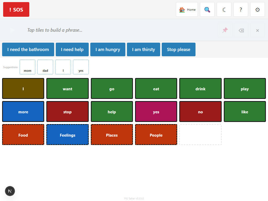
Pie Talker offers four visual styles—each with its own personality, spacing, corner radius, and color palette. These are design aesthetics, not age categories. Choose the one that feels right for the communicator.
Playful
Rounded corners, vibrant colors, generous spacing. Warm and inviting. The default aesthetic.
Modern
Clean lines, minimal design, subtle colors. Feels like a premium app. Great for teens and adults.
Classic
Traditional AAC look. Clear borders, familiar layout. Comfortable for people who have used other AAC tools.
High Visibility
Maximum contrast, thick borders, bold text. Designed for low vision. Meets WCAG AAA contrast ratios.
These are styles, not age categories
This is a deliberate design decision. Many AAC apps label their themes "child," "teen," and "adult"—which forces users into categories based on age rather than preference. A 40-year-old can use Playful. A 12-year-old can use Classic. A 25-year-old might prefer High Visibility because of a visual impairment. The communicator (or their support team) picks whatever feels right. No judgment, no labels.
Display Modes
Three display modes control the overall brightness of the interface:
- Light — White backgrounds with dark text. The standard look.
- Dark — Dark backgrounds with light text. Reduces eye strain in low-light environments and can save battery on OLED screens.
- System — Automatically matches the operating system's light/dark preference. If the device switches to dark mode at night, Pie Talker follows.
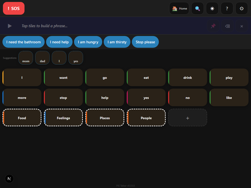
Dark mode works with all four aesthetics. The combination of High Visibility + Dark mode provides extremely high contrast for low-vision users in dimly lit environments.
Accent Color
The accent color appears on interactive elements like buttons, the phrase strip highlight, the active tile border, and the navigation indicators. It gives the app a personal touch without affecting readability.
Choosing an accent color
In Settings → Appearance → Accent Color, pick from a set of curated colors or enter a custom hex value. The app updates in real time as you browse colors, so you can see the effect immediately.
Font Choices
Reading ability varies widely among AAC users. Pie Talker offers three font options:
- System — Uses the device's default font (typically San Francisco on Apple, Roboto on Android, Segoe UI on Windows). Familiar and well-tested.
- OpenDyslexic — A typeface specifically designed for people with dyslexia. Weighted bottoms on letters reduce letter-swapping and improve tracking.
- Lexie Readable — Another dyslexia-friendly font with clear letter differentiation. Letters like b, d, p, and q are designed to look distinct from each other.
The font applies to tile labels, the phrase strip, prediction suggestions, and all text throughout the app. Settings menus use the system font for consistency with the device's other apps.
Icon-to-Label Balance
Different communicators rely on different parts of a tile. Some focus on symbols and barely read text. Others read fluently and find symbols unnecessary. The icon-to-label balance slider lets you adjust this:
- Symbol only — Large symbol, no text label. For pre-literate communicators who navigate by picture.
- Symbol + small label — Symbol takes most of the space, small text below. The default for early stages.
- Balanced — Symbol and text share the tile equally. Good for transitioning readers.
- Label + small symbol — Text is prominent, small symbol above. For communicators building literacy.
- Text only — No symbol, just the word. For fluent readers who want a clean, fast grid.
This setting is global—it applies to all tiles at once. Find it in Settings → Appearance → Icon/Label Balance.
Tile Shape
Two tile shape options are available:
- Rounded — Tiles have rounded corners. Softer, more approachable look. Used by the Playful and Modern aesthetics by default.
- Square — Tiles have straight corners. Traditional grid layout. Used by the Classic and High Visibility aesthetics by default.
You can override the default shape for any aesthetic. A Classic layout with rounded tiles works just as well as a Playful layout with square tiles. Find this in Settings → Appearance → Tile Shape.
Font Size Override
Three font size settings control how large text appears on tiles:
- Default — Sized to fit the current tile density and aesthetic. Scales automatically with grid dimensions.
- Large — Increases tile label text by approximately 25%. Useful when the communicator can see the symbols but struggles with the text.
- Extra Large — Increases tile label text by approximately 50%. Pairs well with the High Visibility aesthetic and large tile sizes.
Font size override applies to tile labels only. UI text in settings and menus follows the device's accessibility text size settings.
See what feels right
Four aesthetics, dark mode, accessible fonts. Try them all—switch anytime.
Open Pie Talker — Free